


Alpha Omega contacted me for a full rebranding of their business. They are a cannabis grower and supplier and wanted a logo that incorporated their name and was an obvious indicator of their field.
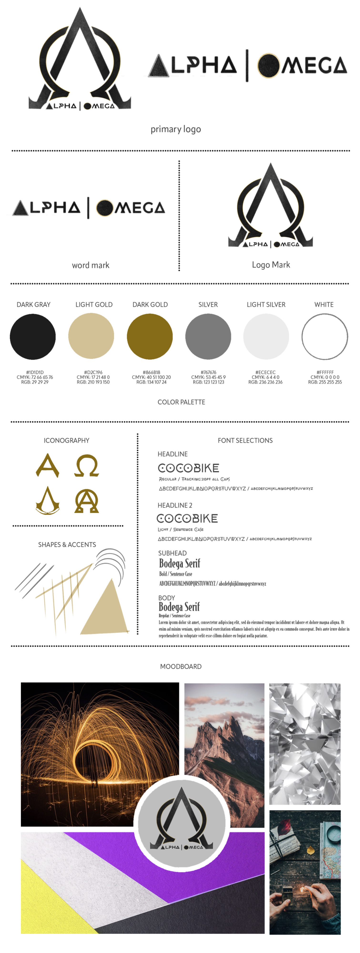
After discussing their business, goals, and culture I started putting together inspiration I found and some supplied by the Alpha Omega team. From this, I created a Brand Style Guide and started sketching out logo ideas. The team wanted to incorporate their name into the logo and wanted something with a bit of texture. They wanted simple with a little bit of pop.
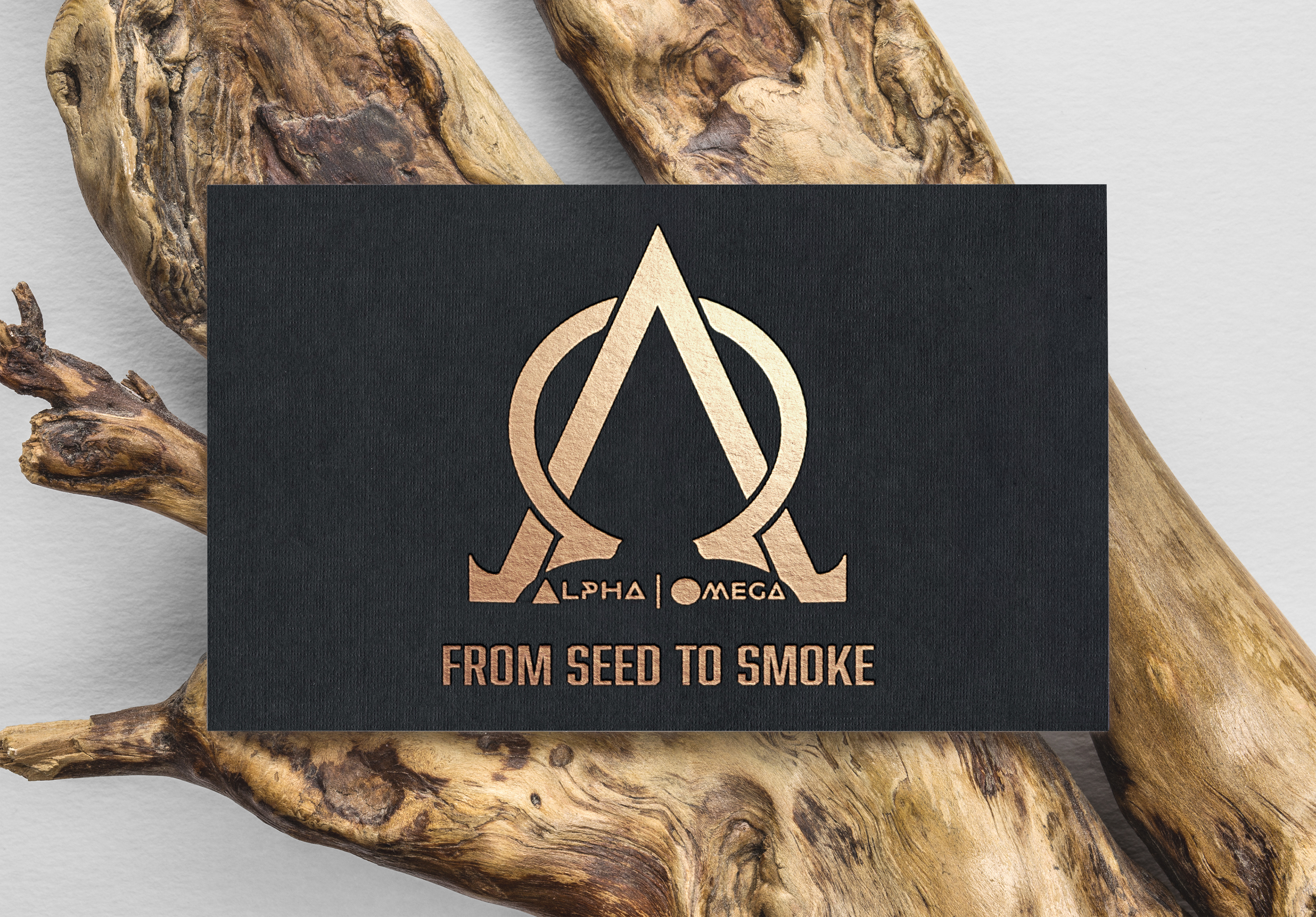
After some iterations, I landed on the logo design that we ended with. The logo is lightly textured with black and has clean lines. The logo is also rimmed with a slight gold outline for the Omega part of the simple, and a silver outline for the Alpha signal. This gold and silver outline is continued in the first letters of the business's name.
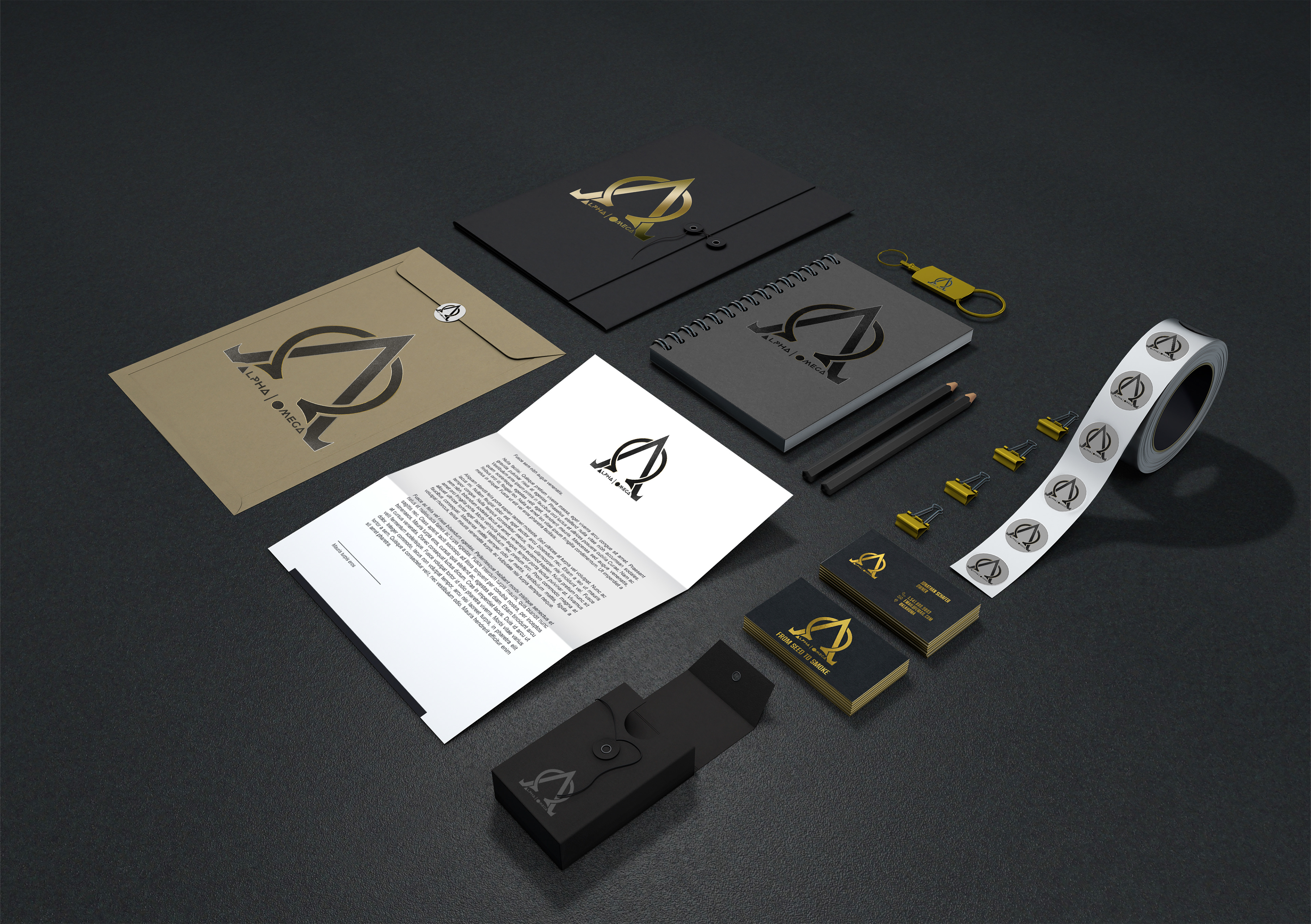
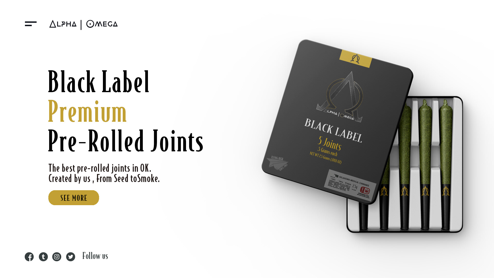
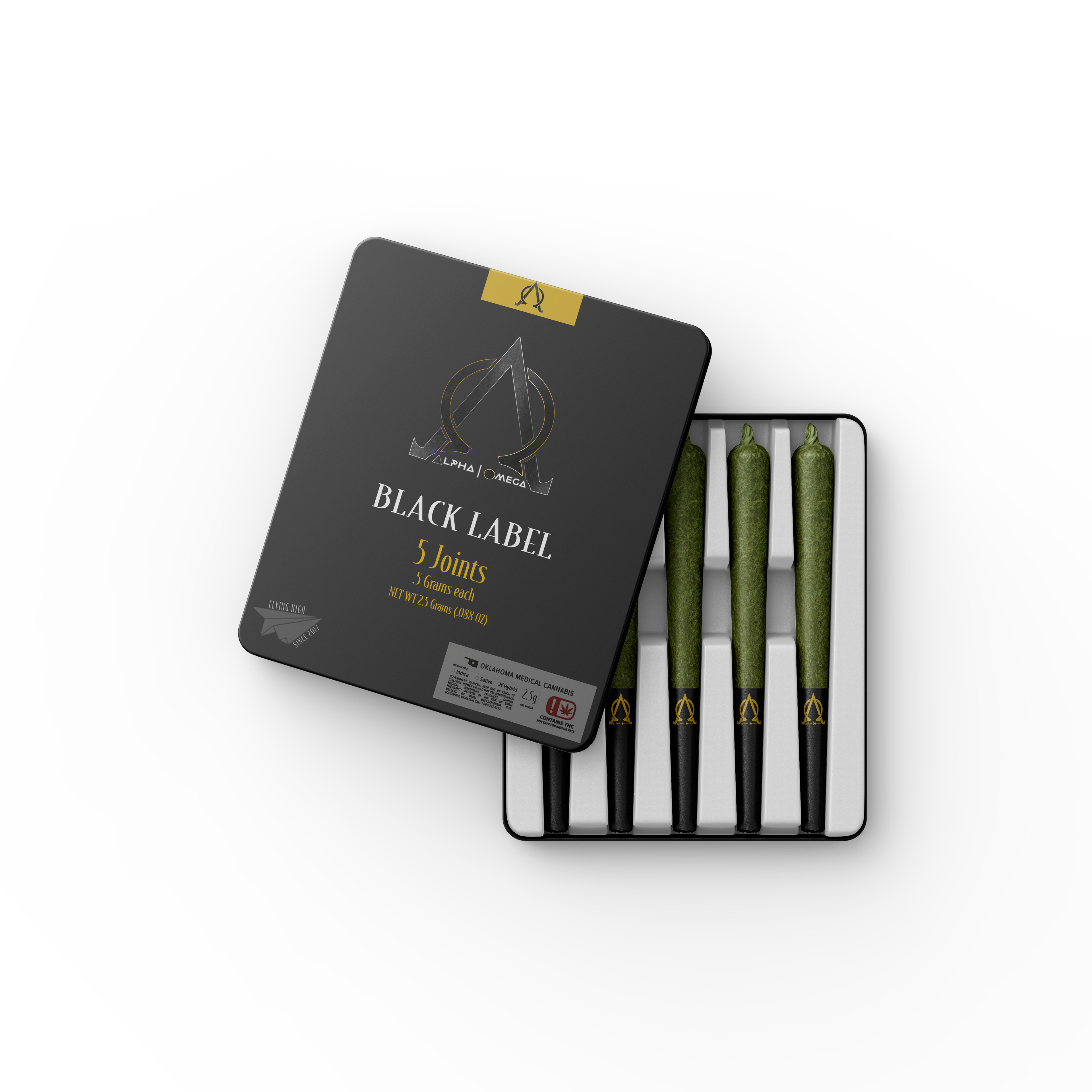
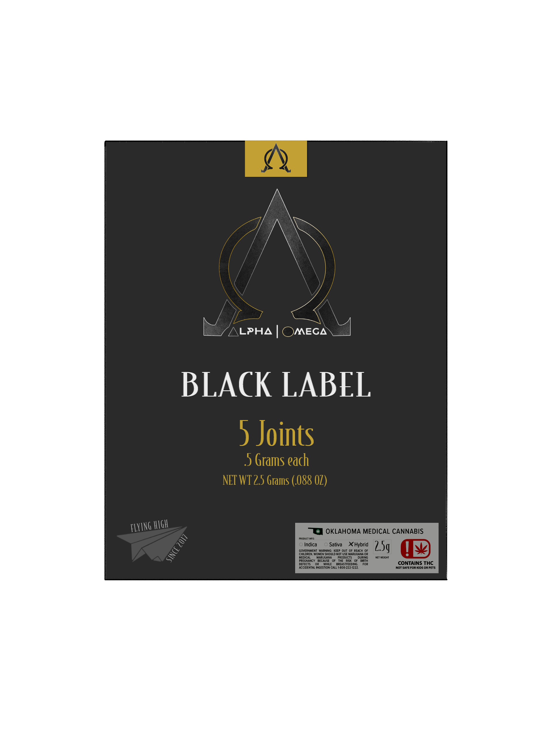
The team at Alpha Omega was really happy with the design and wanted to build their full branding package around it. For this, we created designs for business cards, letterhead, folders, notebooks, t-shirts, Product designs, and banner ads.
The dark grey is continued throughout all the designs presented, all highlighted with just a bit of gold. A logo that almost blends into the background except for that metallic shine. Dark, Reserved, and confident - just like the team at Alpha Omega.
I continue to work with these guys on social media and packaging design.